
How to Lie with fMRI Statistics

In 1954, Darrell Huff wrote a classic book called "How to Lie with Statistics" in which he described ways in which statistics can be used to mislead readers (and consumers and voters and...) The goal was not to encourage people to actually "lie with statistics", but rather to assist readers in evaluating stats objectively without falling prey to deceptive arguments.
fMRI Statistics provide another means by which "lie" to produce misleading data, often unintentionally, and it's essential that readers be aware of some of the pitfalls both when producing and consuming neuroimaging data. This is also not intended as fodder for the anti-fMRI crowd who argue that it's all bunk-- fMRI results can be very robust and reliable but its important that both the producers and consumers know how to determine what's real. For good data, it often doesn't matter what stats are done -- the effect will be obvious.
Here are some of the ways fMRI stats can lie (UNDER CONSTRUCTION: This was hastily written and needs some editing, more figures and the addition of a few more points). A basic understanding of statistics is assumed.
Group averaged data
Group averaged data (as in Talairach space) can be a wonderful way to extract the general pattern and notice trends that may not have been obvious in data from single subjects. But ideally, one hopes to see the same pattern of data in the majority of subjects.
Group averaged data can be misleading because:
- if there is high anatomical variablity in the focus of activation, there may not be enough overlap for an area to show up in the group averaged data
- because of the above, many people do alot of spatial smoothing (blurring) of the data to increase the probability of alignment and several small foci may blur into one large one
Recently random effects analyses have become more common in imaging to enable one generalize from the sample to the general population; however, the recommended sample size is larger than typical fMRI studies (minimum 10 subjects).
The Talairach coordinate
One common practice that originated with PET data is to simply report the Talairach coordinate of the centroid or peak of activation. One then looks up the coordinates in an atlas and cites the name of the gyrus/sulcus, region or Brodmann's area. While this provides some information and facilitates comparisons across labs, remember that activation is seldom a single point and the cluster activation may encompass several regions. My personal favorite "lie" is when some task activates most of the intraparietal sulcus (which is ~7 cm long in humans), a single point is cited, and the label for the region can be either the superior parietal lobule (if the point lies even 1 mm medial to the IPS) or the inferior pariteal lobule (if the point lies lateral to the IPS).
How meaningful is it to say that the activation below falls at -33, 31, 52 in the postcentral gyrus (when it is 29 cm^3 of brain and also includes motor cortex, frontal eye fields and the intraparietal sulcus?)
It can also be very difficult to decide how to treat clumps of foci. Sometimes two nearby foci are likely to belong to the same area; other times they're not. How they get grouped depends strongly on the software's criteria or the experimenter's judgment and the threshold employed.
The "Representative subject"
Lest one think that group analyses are necessarily evil and single subjects are the only way to go, single subject data can also be misleading. If you have eight subjects, you could try to show data from each one of them but that can be an overwhelming amount of data for the reader. And quite honestly, some subjects' data can be butt ugly (do you keep that subject or throw them out as an outlier?). A common solution is to show a "representative subject" though individual variability can be considerable, especially for complex patterns. Sometimes, there is no truly "representative" subject.
The importance of the representative subject in imaging is particularly evident in some technically challenging studies such as retinotopic mapping. The images that make Nature covers typically show the best subject. This is important to show how beautiful the images can be, but I know I was certainly surprised to find how noisy the data was for randomly chosen subjects. It seems that subjects with clear retinotopic maps show them fairly consistently, sometimes only in one hemisphere. Some of this variability is likely due to individual anatomy (e.g., subjects with a relatively straight calcarine sulcus might be better). I don't think the less-than-perfect subjects discredit the phenomenon, but don't expect the first subject you scan to always show "Nature-cover" data.
My own personal approach is to try to show both the group data and evidence that it holds up in single subjects (e.g., by showing bar graphs with one bar per subject and doing stats on those values).
A>0, B not > 0, therefore A>B logic
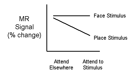
An amazingly common mistake in logic, often done by scientists with a PET background is to do two statistical tests (A vs. baseline and B vs. baseline). If A vs. baseline is significant, but B vs. baseline is not, they then conclude that the area is activated more by A than B. A glance at the following graph should make it obvious why this logic is incorrect:

An area can fail to meet significance either because the effect size is smaller or because the variability is larger (for Faces above, both are true compared to Places).
It's even theoretically possible to find the A>0, B not> 0 result when A and B are exactly equal if they differ in their variability. Below Places are significantly greater than the baseline but Faces are not. Would you therefore conclude that Places are greater than Faces in this area?

The only way to really test whether A and B are significantly different is to compare them directly with one another (e.g., with a t-test).
Is it activation for A or deactivation for B?
Here's a hypothetical example. Let's say an auditory task activates auditory cortex but deactivates visual cortex (relative to a rest condition) because subjects attend less to their visual world when they're listening. But then you add a third condition of a tactile task (which let's say activates somatosensory cortex but has no effect on either auditory or visual cortex). If you do a subtraction of tactile - auditory, you could see positive activation in visual cortex. Does this mean touch uses V1? These sorts of issues suggest the importance of including baseline conditions (but that's another can of worms) and judiciously picking the comparisons you wish to make.
Interactions for the wrong reasons
One powerful technique for asking more sophisticated questions in imaging data is to look not just for main effects, but interactions as well using factorial designs. These have the same pitfalls as any non-imaging factorial analyses, but imagers sometimes forget their stats or never totally understood them in the first place. Interaction effects can be particularly thorny. If you see an interaction, you need to double check that it's occurring for the right reason.

Your hypothesis may be very specific. For example, consider this prediction. You show either faces or places (main effect) and either have subjects do a attend to something else (counting backwards by steps of 7) or attend Interaction to the stimulus to make a judgment (e.g., detecting when the same image appears twice in a row). Your prediction may be that say the FFA will show an interaction as follows (possibly in addition to main effects of stimulus and attentional state). That is, the response to places should be low regardless of attentional state. The response to faces should be greater especially when subjects are attending to the faces.
If you just do a factorial analysis in your statistics software and find a significant interaction effect in the FFA, can you conclude your hypothesis was correct?... No! Other patterns such as the following could also produce a significant interaction of the same magnitude but would not be consistent with your hypothesis.

The bottom line is, if you're looking for interactions, be sure to look at the overall pattern with respect to your hypothesis, not just their significance.
Uncorrected (and overcorrected) data
In a dataset of 64 x 64 voxels x 10 slices, you have 40000+ voxels. If your p value is .05 (a 5/100 probability that a given voxel is significant due to chance), you should have 2048 voxels significant simply due to chance. This illustrates the need to correct for multiple comparisons (Bonferroni correct) in fMRI data. Alternatively, you can do things like set a minimum cluster size (e.g., it's unlikely that a clump of 30 adjacent voxels would all be significant due to chance so if you see an activated region that size, it's probably real). Additional statistical inflation can occur because our assumption that each time point is independent of every other time point is not really true so true statistics need to factor out the "autocorrelation". These issues are described further elsewhere in fMRI for Newbies in the fMRI Design slideshow.
I think that in trying to avoid spurious results (Type I errors), many of us err on the side of overcorrecting and disregarding activation that is real (Type II errors). Some scientists regularly use thresholds like p < 10-20. While we can be fairly confident that the areas they do see at those strict thresholds are very likely real, how many real areas didn't show up and is the one that did the only critical brain region?
Motion artifacts
I once saw an eminent scientist show a brain image where the anterior rim of cortex was activated and the posterior rim was deactivated. He weaved a very elaborate interpretation to account for it until an audience member with more extensive hands-on imaging experience pointed out that his pattern was the classic signature of a motion artifact.
My personal experience is that motion correction algorithms are usually "garbage in, garbage out" but nonetheless if you suspect motion, running a correction algorithm can help you quantify it and examine whether any motion appears synchronized with your task. My slideshow on data quality includes more opinions on motion correction.
How to find what you're looking for (because the stats told you to look there)
It is not uncommon to do a statistical test to find an area (Task A > Task B) and then extract the time course from that region. The concern comes when the time course is used as further justification that the difference is real. By necessity, the time courses have to show you what your looking for. Even in a noise dataset ("screen saver scan") you can lower the threshold enough to find activation and then see that the time course shows the expected trend.
I am a big fan of including time course data in publications. Ideally it's nice to have extract a time course from a region of interest defined by an independent measure, either (a) a different comparison or independent localizer, or (b) (an) additional run(s) other than those from which the time course was extracted. The latter case (b) is essentially a way of verifying test-retest reliability. If these means are not possible and time courses are included, you should at least acknowledge that they are expected based on the stats and don't act so surprised.